Case Study:
Transient Theaters
Project Overview
This app focuses on review-tracking for a movie theater.
The main purpose of this app is for users to easily access reviews of currently released movies and flow easily to purchasing tickets after wards.
The Product:
Project Duration
April 2022- June 2022
I found it hard that a lot of movie apps are not as accessible and efficient enough to my liking for people who look for good movies to watch or discover through word of mouth i.e. movie reviews, tickets, and locations in one app.
The Problem:
My goal for this movie-review app is to be an all-in-one movie app that lists current movies playing, their reviews from actual movie goers, and able to buy tickets while keeping accessibility in mind with the design.
The Goal:
Generalist UX Designer
My Role:
Conducting interviews, paper and digital wireframing, low and high fidelity prototyping, conducting usability studies, accounting for accessibility, and iterating on designs.
My Responsibilities:
Understanding the User:
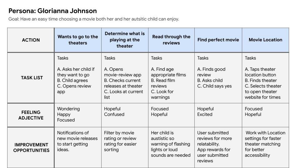
I conducted interviews and created personas to have a better picture of the users I’m designing this app for. The primary user group I used was a mother and her autistic child finding the perfect movie to watch by reading reviews and warnings.
My assumption going into this research was more or less confirmed but I soon found out that not many movie theaters do have accessibility options in their theaters but a lot of their apps failed to include that information.
Summary:
Autistic Users:
Many theater apps don’t show whether certain movies are watchable for autistic users.
Pain Points:
Review Pages:
Movie apps tend to only focus on tickets but don’t put alot of effort in allowing their users to input on their views of the movies they watch.
Movie Warnings:
I wish movie theaters added more focus to movie warning relating to users who are epileptic.
Movie Reviews:
I want user reviews to influence the theater’s ratings and not just your typical review sites to give users more influence.
Personas:
User Journey Map:
Starting the Design:
I conducted interviews and created personas to have a better picture of the users I’m designing this app for. The primary user group I used was a mother and her autistic child finding the perfect movie to watch by reading reviews and warnings.
My assumption going into this research was more or less confirmed but I soon found out that not many movie theaters do have accessibility options in their theaters but a lot of their apps failed to include that information.
Paper Wireframes:
Simple and clean navigation was my design principle when creating these wireframes.
I thought as a user that when looking for movies, I want the important info first before I think about picking the movie.
Digital Wireframes:
These pages are what appears when you select one of the three buttons of the second movie page.
Transparency is my best friend and if users want more information on where the movie is, what its about, or if its to their taste. They have these pages to help.
The user flow is to allow access to catalogs of reviews separated by new releases, no longer released, and streaming categories. Within that flow it will give information of theaters showing that movie.
Low-Fidelity Prototype:
I conducted a moderated usability study to figure out how to improve on the app design and cover any blind spots I may have missed.
Usability Study: Findings
Users picked high rated movies first.
Users want accessible ways to submit user reviewers.
Users are able to follow the steps to find tickets and showtimes.
Round 1 Findings
Text tend to look too small.
Color palette feels too red.
User flow is complete and functional.
Round 2 Findings
Refine the Design:
Mockups:
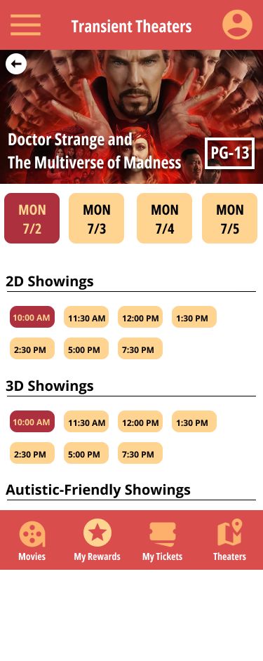
My main goal was basically to mimic the classic theater where its all hollywood-esque and easy to immerse oneself. I chose red and yellow in that case to give off that classic vibe. I also focused on images that help reflect the movies I pick.
More Mockups:
The final High Fidelity Prototype presents a clean userflow for reviewing, reading, and purchasing tickets in relation to movies.
High-Fidelity Prototype:
Added in information for every movie whether the movie is accessible to autistic people or people with seizures.
Accessibility Considerations:
Added showtimes where certain movies can be altered or changed to help be watchable for autistic audiences.
Image-heavy for people with reading disabilities for easier movie selections.
Going Forward:
“I have used AMC Theaters App to order tickets and look at possible movies I want to watch but this app in particular has features I wish AMC can implement to make their app better. If I was a near a theater with this app, I’d be a repeat user.”
Impact:
I learned that you can be a UX designer for many projects til your last day on the job but there is always testers of your designs that finds something your experienced eye couldn’t catch. Usability studies is a US designer’s third eye.
What I learned:
I would conduct another usability study with more autstic users since autism is a spectrum which means not every autstic user will have the same experience using this app.
Next Steps:
Conduct more research on people who are epileptic to help better understand for movies with flashing lights.
Research more on color and high contrast accessibility for better visuals.


