Case Study:
Eloteology
Project Overview
Eloteology is a food truck that specializes in Mexican cuisine with a flair of corn. Our typical user/customer ranges around 15-65 years of age and most users are latine/hispanic.
The Product:
Project Duration
August 2022 - September 2022
Many food truck websites focus too much on food to where their managing of their sites can fall behind in quality compared to the food they serve
The Problem:
I want to modernize Food Truck branding and make ordering easier for the user to get their food quickly.
The Goal:
My Role:
Generalist UX Designer
Conducting interviews, paper and digital wireframing, low and high fidelity prototyping, conducting usability studies, accounting for accessibility, and iterating on designs.
My Responsibilities:
Understanding the User:
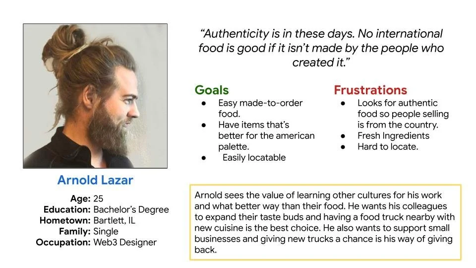
I conducted user interviews with friends and family of Mexican descent which help me form user personas. What I discovered that alot of these food trucks and restaurants have really good food but so many of them fall behind technologically with their outreach on social media and the internet in general. These types of websites tend to clunk alot of things together that can overwhelm a user of today where short and sweet is the prime.
Summary:
Navigation:
User interfaces tend to be clunky and clustered
Pain Points:
Color Palette:
Alot of color palettes really are too bright or don’t mesh well. Too bright.
Experience:
Mexican Food Trucks tend to have few items displayed due to space. Having an easy access menu online can help display their other items.
Personas:
User Journey Map:
Starting the Design:
The websites I visited tend to overuse alot of pages for very small things so I tried to cutdown on the pages for the most important ones our users would click the most frequently.
Sitemap:
I started sketching some wireframes to help organize where everything might possibly fit without excess.
I designed the mobile homepage like building blocks stacked on each other.
Paper Wireframes:
Designed these digital wireframes on Adobe XD. Translated these from the paperwire frames for a better look on how the website will look.
Digital Wireframes:
Translated the mobile paper wireframes to digital to showcase how content in this website will downsize on a mobile phone.
Digital Wireframes (Size Variation):
To create a low-fidelity prototype, I connected all the screens involved in the user flow that will allow ordering food and checking out.
Low-Fidelity Prototype:
I conducted a moderated usability study to figure out how to improve on the web design and cover any blind spots I may have missed.
Usability Study: Findings
Font Size - Many of the users found the font too small to read.
Pickup Time - Users said the site lacked a pick up time option.
Users said the payment section needs its own page or window.
Refining the Design:
Mockups:
Alot of food truck websites tend to not have coherent color palettes which can hurt the eyes of users so I went with a muted navy blue with buttons and interactions more saturated for them to pop up.
More Mockups:
More Mockups (Size Variation):
My hifi prototype follows the same user flow as my lofi prototype but with implementation of my second usability study.
High-Fidelity Prototype:
Made my website focus on dark colors so it won’t be too bright for users with light sensitivity.
Accessibility Considerations:
Made sure buttons were heavily contrasted so they are easily found by people who are sight impaired.
Images were used to help people who were unfamiliar with mexican dishes.
Going Forward:
Our target users shared that convenience and straightforwardness is what they like about the website and knowing where to click influenced how I organized the pages and button placements to feel as smooth as possible.
Impact:
I learned that everyone has only two eyes and that having users participating in studies basically becomes your extra pair of eyes catching blind spots you didn’t see before.
What I learned:
Conduct follow-up usability testing for the website.
Next Steps:
Identify and additional needs from the users.
Research more on color and high contrast accessibility for better visuals.


